Throughout the evaluation, I analyzed the website's navigation, information architecture, visual design, and interactive elements. By putting myself in the users' shoes, I actively sought to understand their needs, motivations, and goals when interacting with the website. This empathetic understanding acted as a catalyst for envisioning potential design solutions that could address these issues and transform the overall user experience.

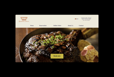
Quartier Parse
Greetings! As a UX designer, I have had the pleasure of working on a remarkable project recently—an Iranian cuisine restaurant website redesign. In this endeavor, I not only addressed existing heuristic problems but also introduced a sophisticated online booking function, complete with exclusive UI elements designed to enhance the overall user experience. Through a combination of research, creativity, and attention to detail, I aimed to create a visually captivating and user-friendly platform that seamlessly connects users to the rich culinary world of Iran. Allow me to share the problem statement that guided this project.
Problem statement
The existing website for an Iranian cuisine restaurant presented several challenges that hindered its usability and prevented users from engaging effectively with the establishment's offerings. The key issues that required attention were:
Outdated Design: The website's overall look and feel were outdated, lacking visual appeal and failing to convey the unique ambiance and cultural richness associated with Iranian cuisine. The design needed a contemporary facelift to captivate visitors and leave a lasting impression.
Heuristic Problems: The previous design exhibited multiple heuristic problems, including poor navigation, inconsistent information architecture, and a lack of clear calls to action. These issues resulted in a subpar user experience, making it difficult for visitors to find relevant information and ultimately impacting the restaurant's online conversion rate.
Booking Functionality: The absence of a streamlined online booking system posed challenges for both users and restaurant staff. The previous system relied on manual processes and lacked user-friendly interfaces, resulting in frequent errors and reservations being overlooked. It was imperative to introduce a sophisticated and efficient online booking function to improve the reservation process for visitors and simplify management for the restaurant.
Given these challenges, my goal was to reimagine the website, addressing the heuristic problems and enhancing the online booking functionality. By doing so, I aimed to create a delightful user experience that reflects the elegance and authenticity of Iranian cuisine while facilitating seamless reservations for visitors.
As the UX designer for this project, my responsibilities encompassed conducting a heuristic evaluation, performing user research, refining the information architecture, facilitating card sorting exercises, designing the navigation structure, creating wireframes, and developing interactive prototypes. This holistic approach allowed me to address the website's usability issues and enhance the overall user experience.
Research and insights
As a UX designer, I approached the Iranian cuisine restaurant website redesign project using a comprehensive research methodology that incorporated elements of design thinking. By combining various research activities such as heuristic evaluation, competition benchmarking, user interviews, and card sorting exercises, I gained valuable insights into user needs, preferences, and pain points, which informed the design decisions for an improved user experience.
Heuristic evaluation
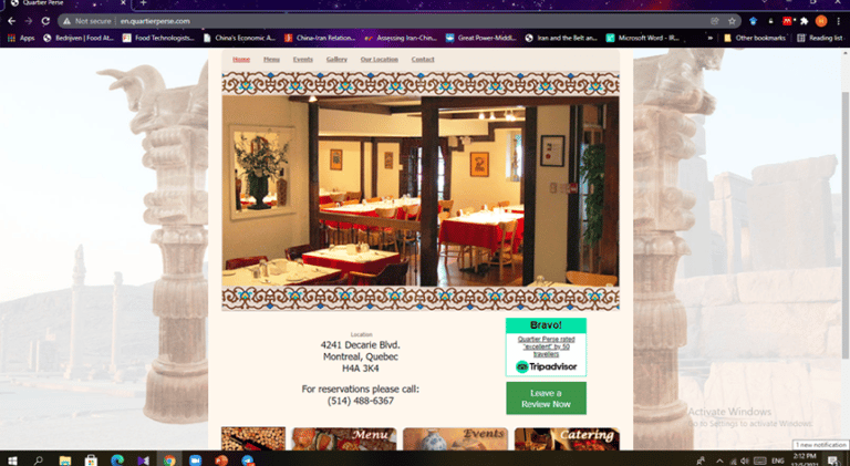
Through the lens of design thinking, I conducted a thorough heuristic evaluation of the existing website. By applying established usability principles, I not only identified the usability issues but also empathized with the users to understand their frustrations and challenges. This empathetic understanding enabled me to envision potential design solutions that would address these issues and enhance the overall user experience.
The heuristic evaluation process allowed me to uncover a range of usability problems, including inconsistent navigation cues, unclear calls to action, and difficulties in locating relevant information. By identifying these issues, I gained insights into the gaps between user expectations and the website's current state. Armed with this knowledge, I set out to devise design strategies and improvements that would bridge these gaps and create a more intuitive and user-friendly interface.
By conducting a thorough heuristic evaluation through the lens of design thinking, I not only pinpointed the usability problems but also used empathy and user-centricity to envision innovative solutions. This approach set the stage for subsequent design decisions, paving the way for an enhanced user experience that would align with the needs and desires of the Iranian cuisine restaurant's target audience.

Information architecture and Card sorting
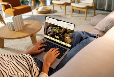
Throughout the evaluation, I analyzed the website's navigation, information architecture, visual design, and interactive elements. By putting myself in the users' shoes, I actively sought to understand their needs, motivations, and goals when interacting with the website. This empathetic understanding acted as a catalyst for envisioning potential design solutions that could address these issues and transform the overall user experience.
Competitive analysis
To gain a deeper understanding of the competitive landscape and derive insights for the redesigned website, it is important to analyze the websites, user experiences, and online presence of these competitors. By studying their strengths, weaknesses, and unique value propositions, we can ensure that our redesigned website stands out and offers a superior user experience.
When conducting a competitive analysis for the redesigned website of an Iranian restaurant, it is important to assess the landscape and identify both direct and indirect competitors. By understanding the strengths and weaknesses of competitors, we can gain valuable insights to inform our own design decisions and create a compelling user experience.
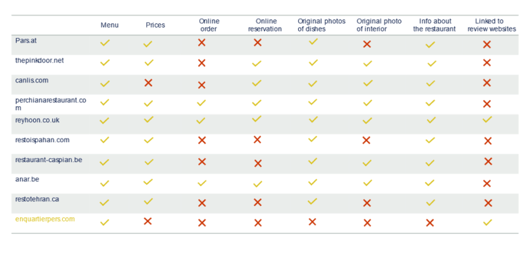
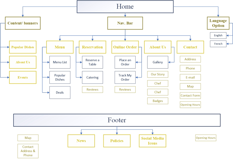
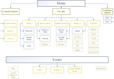
Based on the information gathered through these researches we designed the site map
Introduction:
Creating compelling and relatable personas is essential for understanding and connecting with your target audience. By developing detailed character profiles, you can gain valuable insights into their needs, motivations, and behaviors. This portfolio showcases my expertise in persona design and how it can benefit your business or project. With my skills in crafting rich and authentic personas, I can help you enhance your marketing strategies, product development, and user experience.
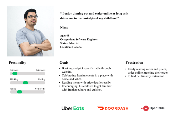
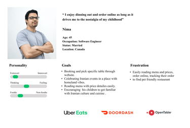
Persona: Nima Farhangi - The Iranian Food Enthusiast
Name: Nima Farhangi Age: 45 Occupation: Software Engineer Location: Vancouver, Canada
Background:
Nima Farhangi is a passionate software engineer residing in Vancouver, Canada, with a deep love for Iranian cuisine. Born and raised in Tehran, Iran, Nima grew up surrounded by the rich flavors and culinary traditions of his homeland. After pursuing a career in software engineering and settling in Canada, Nima continued to embrace his Iranian roots through cooking and exploring the vibrant Iranian food scene.
Motivations and Goals:
Nima's main motivation is to savor and share the authentic tastes of Iranian cuisine. He believes that food is a powerful medium for preserving cultural heritage and fostering connections. Nima aspires to introduce others to the diverse flavors of Iranian food, raising awareness and appreciation for the country's culinary traditions. His goal is to promote cross-cultural understanding and create memorable dining experiences that transport people to Iran through food.
Challenges and Pain Points:
While Nima's passion for Iranian cuisine is strong, he faces a few challenges and pain points along the way:
Sourcing authentic ingredients: Finding fresh and authentic Iranian ingredients in Canada can be challenging, as not all local grocery stores carry them. Nima often needs to explore specialty markets or even consider importing certain ingredients to recreate the true flavors of his favorite dishes.
Preserving authenticity while adapting: Nima seeks to adapt traditional Iranian recipes to suit modern tastes and dietary preferences without compromising the essence of the cuisine. It can be a delicate balancing act to retain authenticity while making dishes accessible and appealing to a wider audience.
Building a community: Nima is eager to connect with fellow Iranian food enthusiasts and create a community where people can share recipes, cooking techniques, and personal stories related to Iranian cuisine. However, finding and engaging with a passionate community can be a challenge, especially when scattered across
different platforms or geographic locations.
How Nima Impacts Your Business or Project:
By understanding Nima's persona, you can tailor your offerings to meet the needs of Iranian food enthusiasts and individuals interested in exploring international cuisine. Here are some ways Nima's persona can impact your business or project:
Authentic Iranian ingredients and spices: By providing a reliable source of authentic Iranian ingredients and spices, you can cater to Nima and others who are passionate about recreating traditional Iranian dishes. This can include partnering with suppliers or even offering subscription-based ingredient boxes.
Recipe collections and cooking resources: Creating comprehensive recipe collections, cookbooks, or online resources that feature traditional Iranian dishes, along with adaptations and variations, can attract Nima and a wider audience interested in exploring the flavors of Iran.
Culinary events and workshops: Organizing culinary events, cooking workshops, or virtual classes centered around Iranian cuisine can capture Nima's attention and engage others who share his love for the flavors and techniques of this culinary tradition.
Food tourism and travel experiences: Curating food-focused travel experiences that take participants on a journey through the culinary wonders of Iran can pique Nima's interest. By offering immersive experiences, you can attract individuals like Nima who seek to explore new cultures through food.
Ideation and sketching
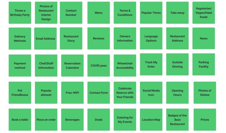
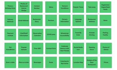
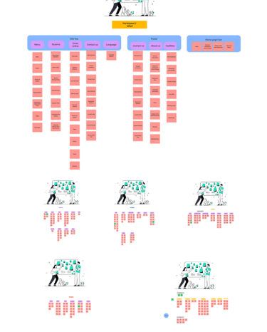
Now it was time for our information architecture and site map. I decided to choose card sorting to gain info that I need about the preferences and mental models of potential users. After conducting 5 card sorting sessions with 5 potential users online using FigJam and Zoom, I gained valuable insights into their thought processes and preferences for organizing information. Card sorting is a method that allows participants to arrange separate pieces of information into groups or categories, providing valuable input for designing information architecture and user experiences.
During the card sorting sessions, participants were given digital cards representing different sections or pages of the Iranian restaurant website. They were asked to move the cards around and place them in virtual piles according to how they would categorize the information. The sessions were conducted in real time using FigJam, which allowed for collaborative and interactive participation.
The objective of the card sorting sessions was to inform the creation of an effective site map and navigation design for the website, by understanding how users naturally organize and group information, I aimed to align the website structure with their mental models, resulting in a user-centered and intuitive navigation experience.
Through the 5 card sorting sessions, several patterns and insights emerged. Overall, the participants showed a preference for grouping related information together and expected to find certain sections in specific categories. These insights guided the creation of a coherent and user-friendly site map and navigation.
To summarize the findings from the card sorting sessions:
Participants consistently grouped menu items and food categories together, emphasizing the importance of clear and intuitive navigation related to the restaurant's cuisine offerings.
The online booking function was expected to be easily accessible and categorized under a distinct section, ensuring users can easily find and utilize this feature.
Users preferred to have separate sections for a restaurant location, contact information, and opening hours, indicating the need for a clear presentation of essential details.
Participants highlighted the importance of showcasing the restaurant's unique features, such as Iranian cultural elements, ambiance, and special events. This insight informed the inclusion of dedicated sections to highlight these aspects.
Participants expressed a desire for easily accessible information about the restaurant's history, chef, and culinary expertise. This influenced the decision to create a dedicated "About" section to showcase these details.
Based on the insights gained from the card sorting sessions, I created a comprehensive site map and navigation design that aligns with user expectations and mental models. The resulting design aims to provide a seamless user experience, allowing visitors to easily navigate the website, find relevant information, and make use of the sophisticated online booking function.
Overall, the card sorting sessions conducted using FigJam and Zoom proved to be valuable in understanding user preferences and organizing information effectively. The insights gained from these sessions played a crucial role in shaping the site map and navigation design for the Iranian restaurant website.
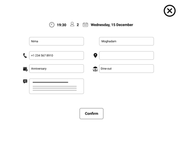
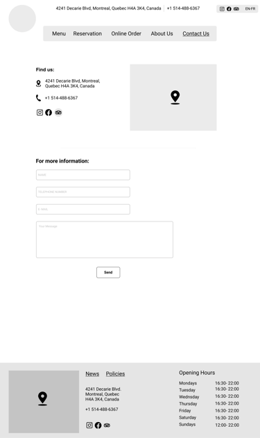
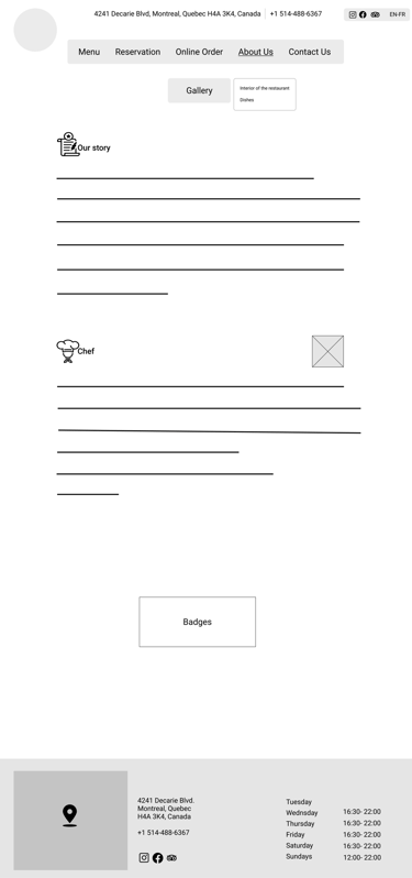
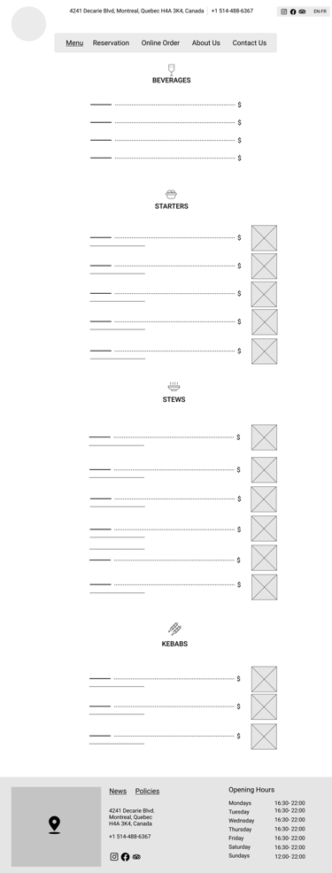
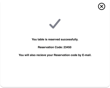


Because of the limitation of the layout and pictures in this platform, the pictures are not placed ideally.


Changes After usability test
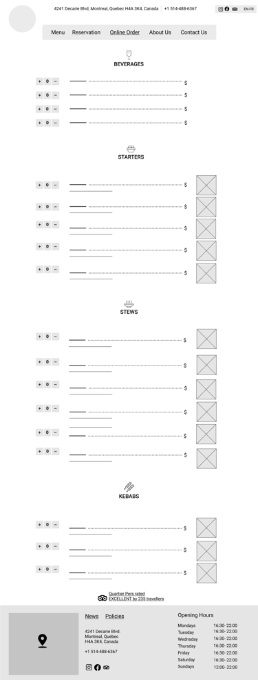
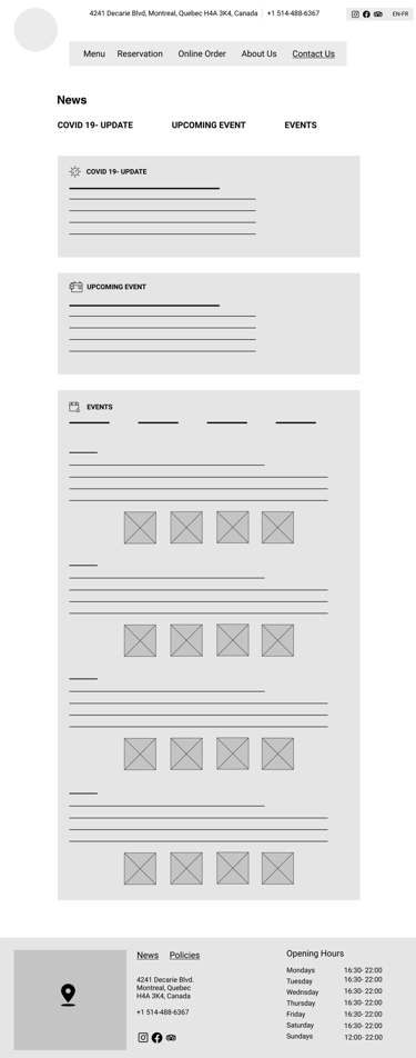
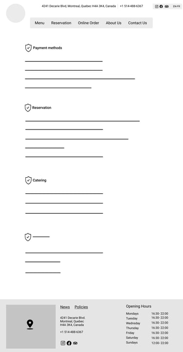
First iteration and wireframes
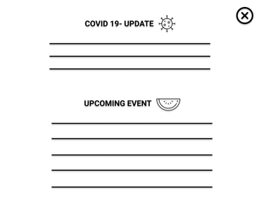
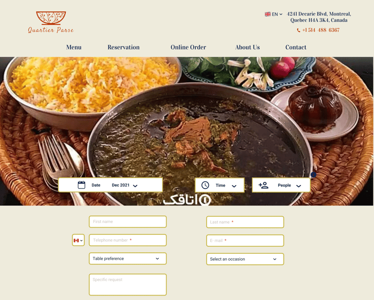
After the first usability test, we found out the navigation menu and some site layout patterns were not optimal for the best experience and accessibility, I redesigned those elements
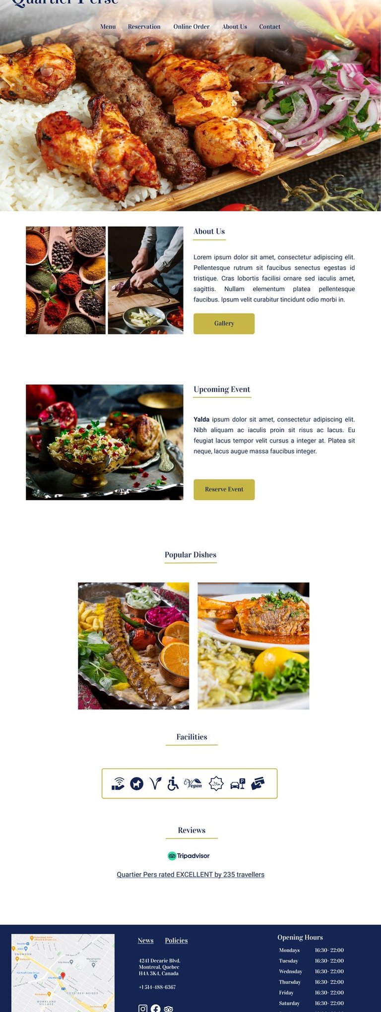
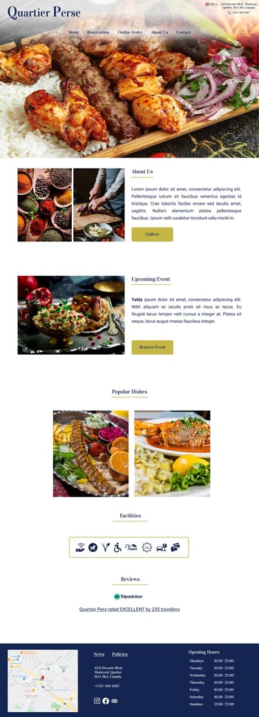
Persona design




My role:
Designs and prototypes are all in mid-fidelity stage
