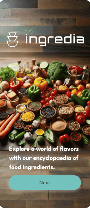
An encyclopedia of food ingredients to help ex-pats and immigrants discover local food ingredients and products to diversify their food basket, empower local farmers, and decrease their carbon footprints


Ingredia
Problem Statement:
Expats and immigrants often face challenges when it comes to identifying local food ingredients in markets. This lack of familiarity with local ingredients restricts their ability to diversify their food basket and discover new products. Additionally, limited knowledge of local ingredients can hinder their efforts to support local production and reduce their carbon footprint. The problem is compounded by the fact that language barriers and different labeling systems make it difficult to navigate and understand product information.
My role and date:
I was a day to day generalist UX designer, I participated in research, ideation, design and testing
Tools:
Design methodology:
Figma, Monkey survey, Figjam, Zoom
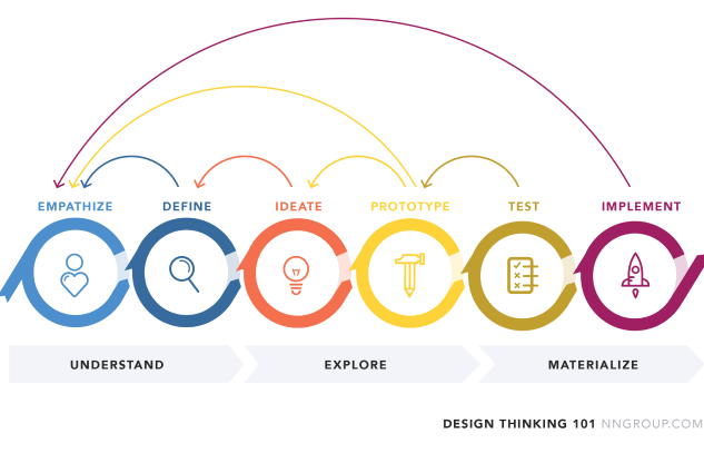
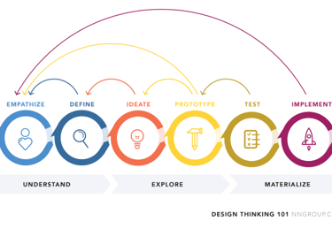
At the core of my design process, I employ the methodology of design thinking, which enables me to approach challenges with a human-centered perspective. This methodology involves empathizing with users to deeply understand their needs and aspirations, defining the problem at hand, ideating and prototyping innovative solutions, and iteratively testing and refining designs based on user feedback. By embracing an iterative and collaborative approach, design thinking empowers me to create meaningful and impactful solutions that truly resonate with users, while constantly striving to improve and enhance their experiences.
User research:
Methods and techniques applied:
User research, survey, interview, card sorting, affinity diagram, user journey, wireframing, usability test, prototyping, and iteration
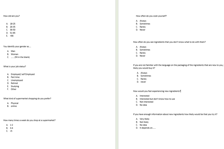
To gain insights into the market and understand the needs of potential users, I conducted a survey using the Monkey Survey website. The survey was distributed among ex-pat and university student online groups, attracting participants who are likely to encounter challenges related to identifying local food ingredients. The survey results provided valuable data that informed the design of the Ingredia page in my portfolio.
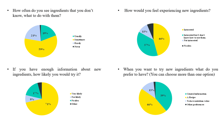
The survey revealed that 79% of participants sometimes or usually come across ingredients they don't know while shopping for food. This highlighted the widespread issue faced by ex-pats and immigrants in unfamiliar food environments. Additionally, only 45% of respondents expressed a willingness to try new ingredients, but this number increased to 71% when participants felt they had sufficient information about those ingredients. This indicated a clear opportunity for Ingredia to bridge the knowledge gap and encourage culinary exploration.
Understanding the desired functionalities of the app, the survey indicated that 46% of participants expressed the need for relevant recipes to accompany the ingredient information. This highlighted the importance of not only providing ingredient details but also suggesting practical ways to use them in cooking. Furthermore, 39% of respondents indicated a preference for general information about the ingredients, such as their origin, cultural significance, and culinary uses. Lastly, 19% of participants expressed interest in nutritional values, suggesting the importance of including nutritional information as part of the ingredient details.
These research insights shaped the design decisions for the Ingredia page in my portfolio, ensuring that it effectively addresses the market demand and caters to the needs of ex-pats and immigrants. By providing comprehensive ingredient information, relevant recipes, general knowledge, and nutritional values, Ingredia empowers users to explore and diversify their food choices while promoting local shopping, supporting local production, and reducing carbon footprints.
Interviews, thematic analysis and affinity diagram:
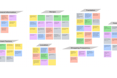
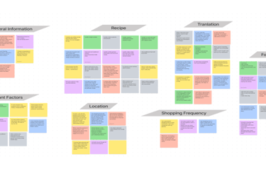
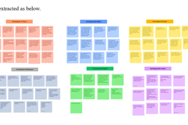
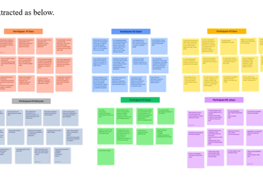
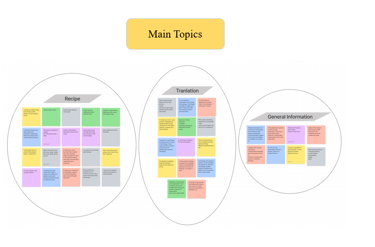
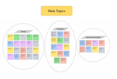
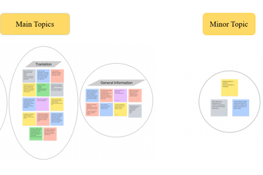
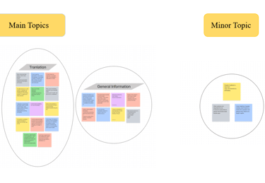
Because we asked our survey participants if they wanted to help us further by providing us with an email, we started to contact them to participate in our interviews. Semi-structured Interviews were conducted via Zoom and they were around 60 minutes each. After the interviews, we started analyzing the data gathered with the Thematic analysis method, and at the end, these data were used to design an affinity diagram.
Persona:
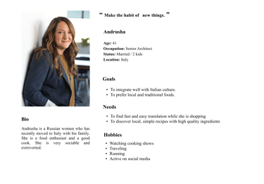
Based on the demography of our survey and our research, we designed our persona. Andrusha is a successful expat, a mum, with 2 kids, and eager to diversify their food basket.
User Flow
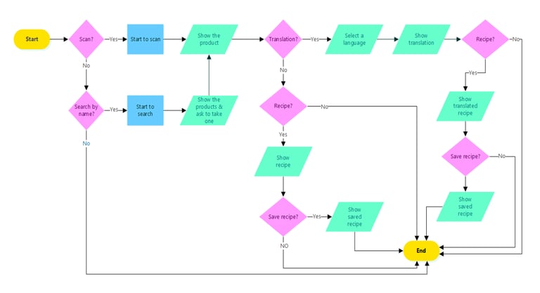
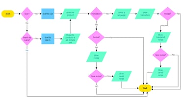
After gathering all these data we started designing our user flow which became one of the pillars of our interaction design later.
I found out that for ease of use in the supermarkets or while shopping I should keep it simple with minimum steps, so a simple search should give a very possible list and even better a barcode search will land on the product page.
Ideation and Sketching and wireframes
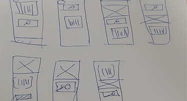
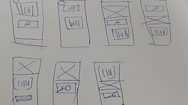
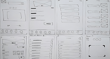
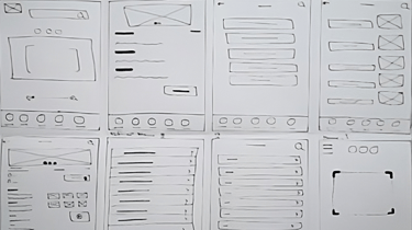
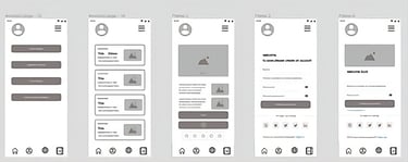
Based on our research, assumptions, our pain points, and mainly our user flow and interaction diagram, and problems we started to draw the first sketches of an app to be used while shopping and cooking


Usability test
Objective: The objective of this usability test is to evaluate the overall usability and user experience of the Ingredia app with five potential users. The focus is on identifying any major usability issues and gathering feedback for improvement.
Participants:
Participant A: An expat living in a new country for two years, interested in exploring local ingredients.
Participant B: An immigrant who recently moved to a different country, looking for assistance in identifying unfamiliar food items.
Participant C: A university student studying abroad, seeking ways to diversify their food basket.
Participant D: An expat with dietary restrictions, in search of detailed ingredient information and nutritional values.
Participant E: An immigrant who enjoys cooking and wants to try new recipes using local ingredients.
Procedure:
Introduction: Briefly explain the purpose of the usability test and assure participants that their feedback is valuable for improving the app.
Task 1: Ask participants to search for a specific ingredient using the app's search function. Observe their ability to find the desired ingredient and note any difficulties or confusion encountered.
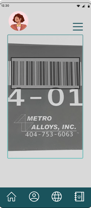
Task 2: Request participants to scan the barcode of a food product and assess how well the app recognizes and provides information for the scanned item.
Task 3: Instruct participants to explore the recipe section and select a recipe that appeals to them. Evaluate their ease of finding relevant recipes and any issues encountered during the process.
Task 4: Ask participants to access the detailed information and nutritional values of a specific ingredient. Observe their ability to locate and understand this information.
Feedback and Questions: Allow participants to share their overall thoughts and provide feedback on the app's usability, interface, and any areas they feel could be improved.
Conclusion: Thank participants for their participation and feedback, emphasizing the importance of their insights in enhancing the app.
Observations: Overall, the usability test revealed that the Ingredia app performed well, with no major usability issues identified. However, some minor adjustments were suggested, such as improving contrast in certain areas to enhance readability and addressing other minor interface inconsistencies. Participants appreciated the app's search function, barcode scanning feature, and the availability of relevant recipes. They found detailed ingredient information and nutritional values beneficial in making informed food choices.
Based on the feedback received, the necessary adjustments will be made to ensure an optimal user experience. These findings will be used to refine the app's design, improve usability, and address any minor issues identified. The usability test confirmed that Ingredia is on the right track and aligns well with the needs of potential users.


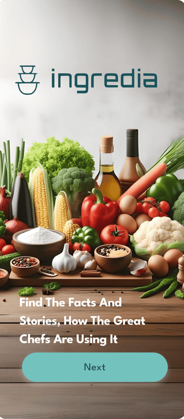
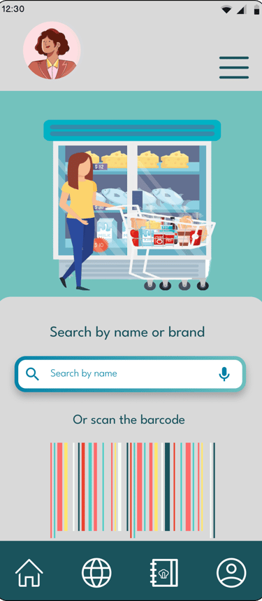
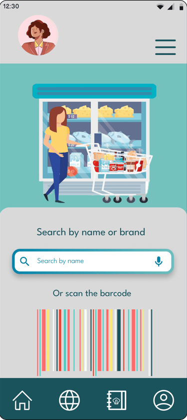
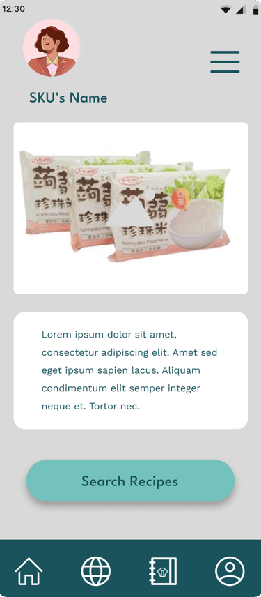


Older iterations
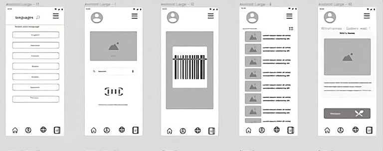
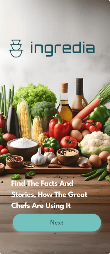
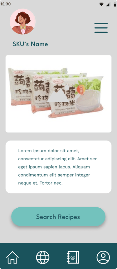
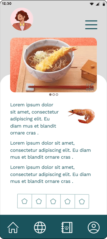
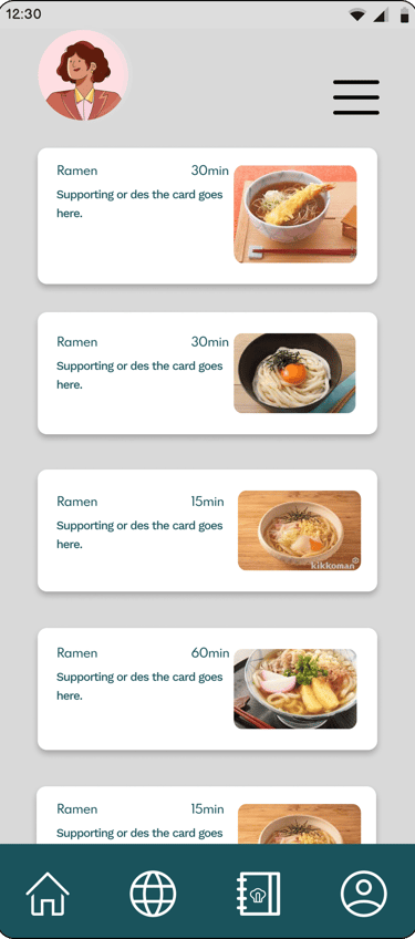
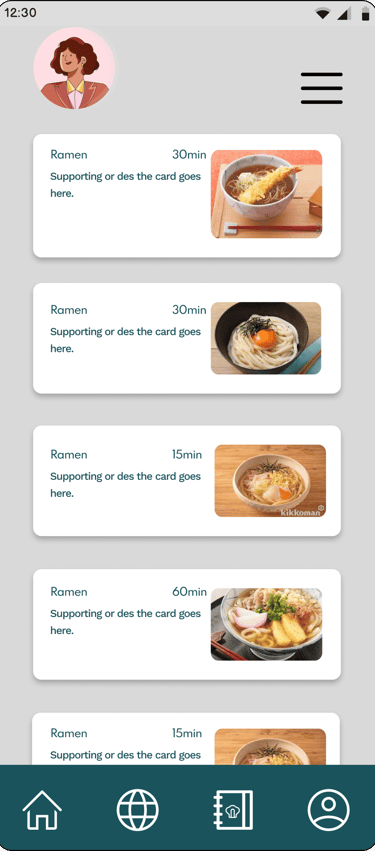
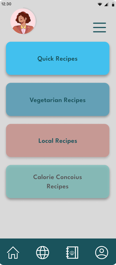
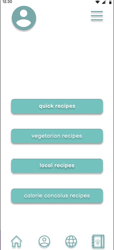
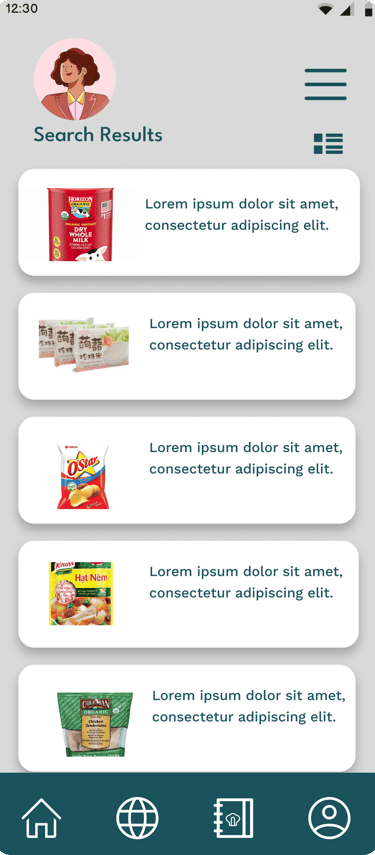
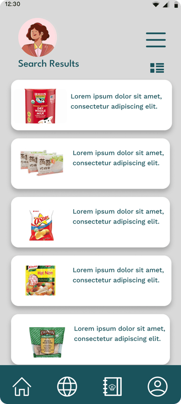
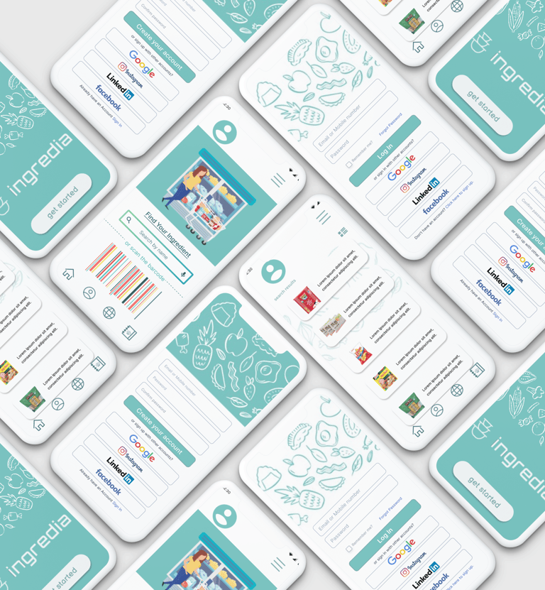
By transitioning from low-fidelity wireframes to mid-fidelity prototypes, the design process of Ingredia reached an important milestone. The mid-fidelity prototypes not only improved the visual aesthetics and overall usability of the app but also set the foundation for the subsequent development stages. The prototypes served as a bridge between conceptual design and implementation, allowing for iterative improvements based on user feedback, and bringing Ingredia closer to its goal of empowering expats and immigrants in their culinary explorations.
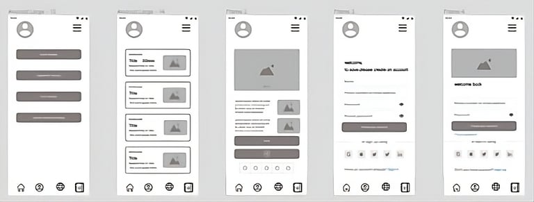
After gathering valuable feedback from the usability test and addressing the identified minor adjustments, the design process of Ingredia continued with the development of mid-fidelity prototypes. These prototypes aimed to further refine the user interface and functionality of the app, ensuring a seamless and intuitive user experience.
Visual Design: The mid-fidelity prototypes focused on establishing a consistent visual design language for Ingredia. The color palette was refined, taking into consideration the previous feedback regarding contrast. Typography was carefully selected to enhance readability, and iconography was updated to improve visual clarity. Attention was given to the overall aesthetic appeal, striking a balance between a clean and modern design while maintaining a warm and inviting atmosphere.
Navigation and Information Hierarchy: The prototypes focused on improving the navigation flow within the app. Clear and intuitive navigation elements, such as tab bars or side menus, were implemented to allow users to easily access different sections of the app. The information hierarchy was refined to ensure that essential content, such as ingredient details and relevant recipes, were prominently displayed and easily discoverable.
Interactive Components and Feedback: Mid-fidelity prototypes introduced interactive components to provide users with a more realistic experience. Buttons, input fields, and other interactive elements were designed with a focus on visual feedback, ensuring users receive clear indications when interacting with the app. Transitions and animations were implemented to provide smooth and seamless interactions, enhancing the overall usability and delight of the app.
Iterative Testing and Refinement: The mid-fidelity prototypes were subjected to iterative testing with a small group of potential users. Feedback from these tests allowed for further refinement of the prototypes, addressing any remaining usability issues or concerns. Iterative cycles of testing and refinement ensured that the final design of Ingredia met the needs and expectations of its target users.








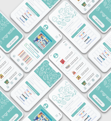
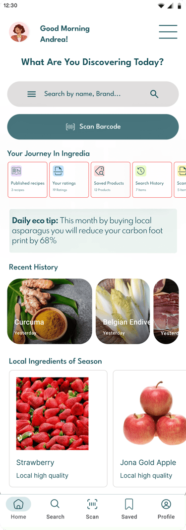
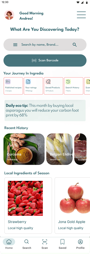
Mid fidelity designs
Designs and prototypes are all in mid-fidelity stage
